



 RADIO
RADIO










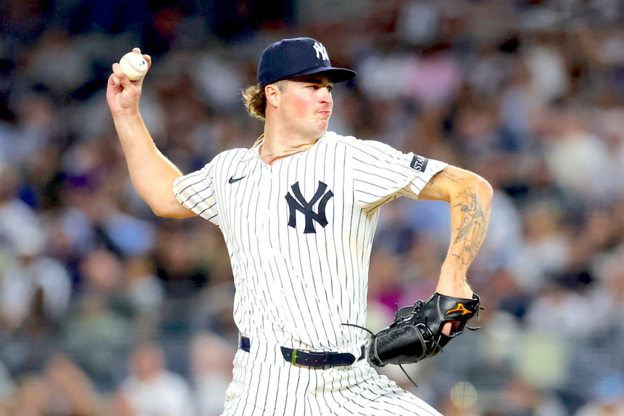
MLB Uniform Power Rankings: Every Team From Worst to First. Read RotoBaller's power rankings for the greatest home and away jerseys for the 2026 MLB season.
With the MLB season quickly approaching the quarter-mark, let's take a break from the action and power rank each team's current jersey combination. For the sake of this article, we will analyze only the team's "standard" home and away jerseys.
While most of these home jerseys have stood the test of time, some have recently undergone modifications that could push them up our list.
What teams have the best jerseys for the 2026 season? Let's dive in!
Featured Promo: Save 50% off the regular price with discount code SUMMER, for a limited time. Exclusive access to our Team Sync platform, DFS cheat sheets, Lineup Optimizers, betting/prop picks, and exclusive content from Nick Mariano and Eric Cross! GAIN ACCESS NOW
No. 30 - Texas Rangers
The Texas Rangers have a relatively standard print on both their home and road jerseys. When playing in Texas, the Rangers wear a white jersey with crisp blue text spelling the team logo and a red outline. The cursive text gives it a slight edge, but beyond that, this jersey is not particularly unique.
When playing away from their home field, the Rangers wear a standard jersey: a grey shirt with bold text that states the team's city. This is one of the worst road jerseys in the sport, as it lacks creativity, which is why it sits at the bottom of our ranking.
No. 29 - Cleveland Guardians
The Guardians have undergone several uniform changes of late, with their most notable change coming at the start of the 2022 season, when the entire club was rebranded as the Cleveland Guardians. As a result, their entire jersey combination was reworked to fit the team's new branding.
When playing at home, the Guardians wear a "modernized" version of a typical classic home jersey. While they still wear a standard white base, the word "Cleveland" is written across the front in a unique cursive print with the team's new logo placed on the shoulder. However, what brings them down is their newer road jerseys. Unlike the home uniform, their road jersey features very standard, bold text across the front, which does not make it stand out.
No. 28 - Los Angeles Angels
While the Angels jersey does not appear overly creative on the surface, one small tweak to the text makes these jerseys stand above the bottom tier in our rankings. On both their home and away jerseys, instead of simple text spelling the club name, they use the logo in the "A" of "Angels" for a special flair.
However, aside from the slight modification to the text, their jerseys do not stand out above the rest of the sport. Their white jersey has no pinstripes and looks very standard to the outside eye. On the road, their grey jersey features subtle hints of red along the lining, adding a touch of color to the palette.
This was a 30.2 ft/sec for Mike Trout, the fastest he's run all year. pic.twitter.com/hWYHYATqZm
— Jeff Fletcher (@JeffFletcherOCR) May 19, 2026
No. 27 - Toronto Blue Jays
The Blue Jays are one of the few teams in the major leagues that have nearly identical home and away jerseys. While some teams opt to spotlight their city or club name on each jersey, the Blue Jays use the exact same layout and text on both the primary and secondary, with the only change being the color.
At home, the Blue Jays wear a white jersey, but opt to utilize a grey shirt when on the road. Their lack of creativity across jerseys keeps them in the bottom half.
No. 26 - Tampa Bay Rays
While the Rays are most known for their alternate jerseys, for the sake of this ranking, we will only highlight their standard jerseys, which keep them in the lower tier. When playing at the "Trop," the Rays wear a white jersey with the team logo in bold blue text to take up much of the center.
Outside of the log, there is not much creativity on this journey. Their road jersey is very similar, a dark blue jersey with the same logo printed down the center. While the blue is a nice twist on the traditional "grey" road jersey, there isn't much that makes these jerseys truly stand out among the 30 clubs.
No. 25 - Washington Nationals
While the Nationals stand out in their alternate jerseys, their standard home-and-away combinations are still very distinct among major league clubs. At home, the Nationals wear a white jersey with the team's name written in cursive on a slant along the front. On the shoulder, fans can spot the team's primary logo, which adds another layer of detail.
While their road jersey is not overly memorable, as it uses standard bold text on a grey shirt, their home jersey is very sharp, which keeps them above the bottom group of our ranking.
No. 24- Houston Astros
Houston's current lineup of alternatives would put them much higher on our list. However, when looking only at their standard home and away jerseys, they sit near the bottom, as both lack creativity and uniqueness. When at home, the Astros wear a simple white jersey with the club name printed along the front in standard bold text.
On the road, they utilize the same font, but instead spell the city name "Houston" in favor of the club name. However, the jersey number is in the same position as on the home jersey (below the text on the front), and, like the home counterpart, it lacks any unique features that make it stand out. The only positive is that Houston's unique color scheme does make it different than other clubs, despite their standard design.
No. 23 - San Diego Padres
San Diego also wears pinstripes at home but leans into their yellow-and-gold palette, with black stripes and dark black text on the front. While the palette looks quite similar to the Pittsburgh Pirates', there are hints of brown in the jersey, which does make it somewhat unique.
On the road, their jersey looks far more distinct, with a brown/grey base and dark black text in a gold outline. Unlike most road jerseys, this print also contains pinstripes, adding another layer of detail. This jersey is far more distinct than the home set and helps keep them slightly above the bottom tier in our ranking.
No. 22 - Athletics
If alternates were considered for this ranking, the Athletics would have a strong case to be in the top-3. In 2026, the Athletics have two of the most unique jerseys in the sport, including their iconic light-green jersey, which features a hint of yellow along the lettering. However, in their standard home and away jerseys, they lack the creativity of other teams.
Their home jersey is a standard white base with yellow-and-green lettering that spells out Athletics along the front. On their road counterpart, the same font and lettering are used to spell the team name, but it is written over a grey base, which complements the team color palette. While their standard jerseys are not in the same class as their alternates, their green/yellow color palette blends perfectly together, which keeps them in the No. 22 spot.
No. 21 - Baltimore Orioles
Like the Athletics, the Orioles make a strong case for sitting near the top of this list when considering their alternate uniforms, as their City Connect uniform and their alternate black uniform look quite good at Camden Yards. However, when ranking only their standard combination, the O's take a slight drop in our rankings.
While both jerseys look similar on the surface, there is a distinct difference between them beyond color. On their home uniform (white), the cursive text spells "Orioles," while their road uniform (grey) features a spotlight on the city they call home, Baltimore. However, the black socks complement the orange script very well, keeping them just outside the top half.
No. 20 - Kansas City Royals
The Royals boast some of the most unique alternate jerseys in the game, but even when looking just at their standard combination, they still sit towards the middle of the pack. At home, the Royals wear one of the sharpest "home" jerseys in the entire sport. At Kauffman Stadium, Bobb Witt Jr. and company wear white jerseys with blue lettering that spells out the club name in cursive. The team logo is placed on the shoulder, adding another layer of detail.
While their road jersey is a bit simpler, the light blue lettering surprisingly matches the grey well, creating a nice color palette. As with the home jersey, the team's logo is also on the shoulder, adding some life to this grey base.
No. 19 - Arizona Diamondbacks
The Diamondbacks are among the clubs with many alternative jerseys in the 2026 season. Currently, they hold two alternative editions, with a third being their City Connect Jersey. However, for the sake of this ranking, we will only consider their standard current home and away uniforms.
Their home uniform is a twist on a typical white jersey, as it is actually "off-white," which blends well with the red lettering spelling "D-Backs" along the front. Their road jersey is quite sharp as well, with a grey base and unique teal lettering along the front that highlights the city rather than the team name. Given that they don't use a simple white jersey at home, they earn a boost on our ranking.
No. 18 - Colorado Rockies
While their production on the field has been among the worst in the sport for much of recent history, the Rockies do wear one of the most unique jerseys in the game. When playing at Coors Field, the Rockies wear a white jersey with standard black pinstripes, but the collar and hat feature hints of purple, making it unique.
On the road, their hint of purple is far more prominent because the text spelling the city "Colorado" is fully purple, as are the jersey number on the front and the icons on the shoulders.
No. 17 - Minnesota Twins
The Twins have some of the most distinctive designs in their home and away jerseys, which boosts their ranking on the list for their creativity. At home, the Twins wear a white jersey with bold, cursive lettering that spells out the team name in bright red. However, below the lettering, the jersey numbers are written in dark blue, which complements the text quite well.
On the road, they take an entirely different design, wearing a grey jersey with pinstripes that features bold text (not in cursive) that states the city name across the front in blue. Instead, the jersey numbers are written in red. Given that the two designs look very different, they deserve a spot just outside the top half.
No. 16 - Cincinnati Reds
Among home jerseys, the Reds may have one of the most cohesive color palettes in the sport. While the jersey itself is very simple in design, it is very effective and has stood the test of time. During home games at Great American Ball Park, the Reds wear white jerseys with the team logo on one side and the jersey number on the other. Down the center, there is a red lining that plays very well with the matching hat and socks.
On the road, their red is instead matched on a grey jersey with "Cincinnati" written across the front in bold text. While the cursive text is typically much sharper, the color choice for the bold lettering keeps this team high on the list.
No. 15 - Detroit Tigers
Their home jersey is one of the most "plain" in the entire sport. While most classic baseball teams have pinstripes on their home jerseys, the Tigers instead wear a plain white jersey with just the team's logo on one side. There is also minimal design on the shoulders as well. This jersey is iconic but also very bland in comparison to some of the modernized versions.
However, on the road, the Tigers wear a more unique jersey, boasting a grey print with hints of blue and orange. Along the front, curved text spells out the city of Detroit with a sharp orange outline along the blue text. The socks and hat also feature a mix of blue and orange that complement each other. While the home jersey is very standard, their road pattern is one of the most aesthetically pleasing among teams in the American League.
No. 14 - Miami Marlins
The Miami Marlins have some of the most interesting standard jerseys in the sport. While they wear a standard white jersey at home, their font and color scheme make them stand out among the rest of the sport. When playing in Florida, their home jersey features a cursive script that spells out the city in black, light blue, and a hint of pink.
On the road, their grey jersey also features hints of other colors, making it "pop" despite the modest grey base. Their alternate jerseys are also among the most creative in the sport, which may push them into the top spot if it were considered.
No. 13 - Chicago Cubs
The Chicago Cubs have worn this home uniform since the mid-1950s. When playing in the Friendly Confines, the home team wears a white jersey with iconic blue pinstripes, with the team logo placed on the right side of the jersey. While the logo has been forged over time, the blue pinstripes have been a staple for home games.
On the road, they wear a grey jersey with an intriguing twist. Instead of the team logo, they use bold letters to spell out the city name on the front, with the jersey number (in red) placed on the lower right-hand side. The team's alternate logo (the walking cub) sits on the right shoulder of both jerseys, which adds an extra layer of detail.
No. 12 - San Francisco Giants
One of the most iconic teams in MLB history will hold the next spot on our list. Their current home jersey is one of the most recent designs on this list as their distinct dark orange and black have mixed into a memorable collar palette. The white base plays very well with the black text on the front (writing "Giants"), and the orange outline adds another layer.
However, when looking at their road jersey, they take a bit of a hit. Instead of having "Giants" written on the front, they instead spotlight their home city, which takes up nearly the entire front half, leaving little room for creative liberty.
No. 11 - Milwaukee Brewers
The Brewers have one of the most unique color palettes in the sport, which pushes them toward the top of our list. At home, the Brewers wear a standard white jersey featuring the club name in bold and a navy blue-and-gold combination that complements each other very well.
When on the road, the team uses the same text and color palette for their front text, but instead refers to the city (Milwaukee) rather than the team name. The hint of yellow is a nice nod to Wisconsin's renowned artisan cheese shops.
No. 10 - Chicago White Sox
Another pin-stripe jersey will hold the next spot on our list. When playing at home, the Chicago White Sox wear white jerseys with black pinstripes that feature not only the team's logo, but also a jersey number. The black pinstripes play off the team's logo and the jersey's white base very well, making it one of the most memorable jerseys in sports.
When on the road, the White Sox wear a gray base jersey with cursive writing (in black) spelling the city name. While the jersey number is also on the front, the team logo is on the shoulder instead, unlike on the home jersey. While the road jersey is not as memorable, the home jersey does much of the heavy lifting for their placement in our ranking.
No. 9 - Los Angeles Dodgers
While simple in design, the Dodger uniform remains one of the most iconic in the game's current jersey lineup. At home, their white jersey with blue hints plays perfectly at Dodger Stadium and is one of the most elegant jerseys to look at. On the front, the Dodgers use blue cursive text to sell out the club name with a red jersey number.
On the road, they once again use the blue cursive text that spells "Dodgers" and a red jersey number on the front, which makes identifying players far easier. The design is simple but has stood the test of time.
Max Muncy'S THIRD HOME RUN OF THE NIGHT IS A WALK-OFF BLAST pic.twitter.com/UvQ0BgntB7
— Talkin' Baseball (@TalkinBaseball_) April 11, 2026
No. 8 - Philadelphia Phillies
Another pinstripe jersey will take the next spot on our list. While most of the pinstriped clubs sport dark stripes on their home jerseys, the Phillies take a different approach. When playing at Citizens Bank Park, the Fightin' Phills wear a white jersey with bright red pinstripes that make their home jersey truly stand out.
On the road, the Phillies wear a simple jersey with curved text that spells the team name "Phillies" in red. While most clubs would have alternate writing on their jerseys, the Phillies have the same text on both their home and away jerseys, giving their combination a unique spin.
No. 7 - Atlanta Braves
The Braves use a standard home/away jersey combination, but they still look very sharp, even though they have been around for most of the game's history. Their current home jersey has become synonymous with the team's illustrious history, as classic white is layered with red and blue lettering spelling out the club name. However, below the text sits a tomahawk, which was added to the jersey in the 1980s.
Their current road jersey is not as sharp as their home jersey, but given the uniqueness of the text on the front and the inclusion of the tomahawk, they sit higher on this list due to their design.
No. 6 - Boston Red Sox
The next team on our list also boasts some of the most iconic uniforms in the entire sport. The home jersey of the Boston Red Sox has rarely changed throughout history, as it is a classic white jersey with bold red text spelling the city name layered across the front. While it is simple, these jerseys have stood the test of time and deserve a spot within the top-10.
Their road jersey is a simple grey and does not stand out among other standard away jerseys, which keeps them lower in our top tier. The grey does not correlate with the red text as well as the standard home jersey does. The lone positive aspect of this jersey is the unique lettering used to spell the team's city (Boston). However, the Red Sox would receive a boost from their unique combination of alternate jerseys. In 2026, the Red Sox have three distinct alternate jerseys, including a green top that matches the iconic Green Monster in left field.
No. 5 - Pittsburgh Pirates
Like the other teams in their city, the Pirates sport jerseys that evoke black and gold. Their home jersey is a white base with a bold font spelling out the team name in black and gold on the front. Along the jersey's lining sit the colors of the city, with the iconic "pirate" logo on the shoulder.
On the road, their grey jersey features unique text on the front, printed in cursive that spells the team's city. Once again, the font is black and outlined in gold, as are the jersey number and the jersey lining. While simple, this color scheme blends very well together, as do the other two professional teams in the city.
No. 4 - New York Yankees
One of the game's most iconic jerseys holds the next spot on our list. At Yankee Stadium, the Bronx Bombers wear one of the most recognizable jerseys not only in the game of baseball but in all of professional sports. Their home jersey is a standard white with stripes and the team logo. However, unlike most jerseys, these do not have player names on the backs.
Their road jerseys are not recognizable, but they have still stood the test of time. They have a grey base with the city name in bold text (in blue), but do not contain the logo on the front.
No. 3 - New York Mets
The Mets wear a very traditional home uniform that has been synonymous with the team's history. When in Queens, the Mets sport a white jersey with blue pinstripes. On the front, there is cursive blue text spelling the club name. However, what makes this jersey stand out is the hints of orange that offset the blue.
When on the road, the Mets wear a grey jersey with the city name in bold, not curved, which brings them down with the top group. However, the blue-and-orange color scheme makes it one of the most aesthetically pleasing in the sport and worthy of a spot at the bottom of the top-3.
No. 2 - St. Louis Cardinals
The Cardinals receive a major boost in our rankings due to their iconic logo. While their jerseys themselves are not overly detailed, their logo is one of the best in the sport, and it is placed on the center of both jerseys, which keeps them comfortably in our top-3. When at home, the Cardinals wear a white jersey with the logo taking up much of the front.
On the road, the Cardinals wear a grey jersey, with the logo once again serving as the focal point, centered. Both jerseys have numbers on the front, both in red text, matching the belt and logo.
No. 1 - Seattle Mariners
The final team on our list has one of the most interesting color groupings among major league teams. The Mariners have a unique blend of blues and grey that leans into the aquatic theme of their team name. When playing in Seattle, the Mariners wear a white jersey with navy blue and "northwest" green text spelling out the club name.
On the road, they wear any blue jersey, making it one of the most distinctive away jerseys in the sport. On the shoulder of this jersey, viewers can spot their primary logo and their cap insignia, an "S" used as the first letter of the word "Seattle," which is written across the front.
More Fantasy Baseball Advice
Download Our Free News & Alerts Mobile App
Like what you see? Download our updated fantasy baseball app for iPhone and Android with 24x7 player news, injury alerts, sleepers, prospects & more. All free!