RADIO
RADIO
Spencer Aguiar dives into the current state of DFS golf, trying to predict what separates sharp players from their square counterparts.
Over 70 million people participate in fantasy sports in the United States each year, a figure that is likely on the low end of future growth when diving into the impact of legalization across the country.
Your old-school yearly fantasy leagues amongst friends have blossomed into this overarching phenomenon that is now known as daily fantasy sports (DFS), and those two worlds have created a 14.91 billion-dollar revenue creator in the year 2025, which may pale in comparison to its future potential when you consider that the market's five-year projection model believes that we are looking at a 30+ billion dollar industry by the year 2030.
Golf, specifically, still has work to do if it wants to capture a larger share of that pie. Yet, studies over the last few years have indicated that the PGA Tour, NASCAR, and the WNBA are the three largest movers and shakers in terms of their current expansion trajectories. You don't have to look any further than the data behind these golf studies, which shows the sport jumped from a sub-10 percent creator in 2022, when analyzing how many of the then 60 million fantasy sports users they reached, to its new high of 15 percent in 2025.
That doesn't seem too shabby for a game that has split its tours between the PGA and LIV and was once considered background noise if you wanted a good night's sleep...
All of that is great for the future of those interested in seeing DFS golf continue to climb the pecking order and reach more households. However, it made me wonder about how the influx of new participants might create a similar "food chain" system like the one we've seen in poker over the years. Think of how most of the money in poker has systematically worked its way from the bottom-of-the-barrel stakes and into the highest limit rooms in the world.
Yes, for any game to work, you need that sort of dichotomy of riches and a path for people to strive towards. Nevertheless, are we heading straight into that oversized aquarium feel, where the sharks are going to eat the guppies and take all the money? And better yet, is it sustainable over time if the current discrepancy between users is too significant?
I write all of this not knowing what I will find as I research this throughout the year and apply it to the sections below. In my opinion, it provides a better, unbiased outlook that won't lead the reader to an answer I am already trying to push. Still, there are two comprehensive questions I want to define throughout this article and answer for those interested.
- How much better are big-money (sharp) players than micro-stake users (square)?
- How can we identify why sharp players exist, and how can we use that information to increase our own expected weekly return on investment (ROI)?
With that concept in mind, let's take a deeper look at this topic.
Research Methodology
The hardest part of this topic is that there is no clear-cut way to extrapolate the data from the sharpest and squarest players for DFS. Sure, I can find a ranking list to identify the site's biggest golf winners, but it would take a more expansive approach to whittle down their exact player pools for the week and compare them to an equal number of users on the opposite end of the spectrum that were the most consistently poor performers on the site. That isn't impossible if I had more access to everyone's player pool weekly, though it would only show why someone won money that season and might ignore the overall difference in quality. We don't need all of us to be matched against only the Michael Jordan's of DFS.
Instead, I decided to look at all ownership totals for players across tournaments throughout the year and compare how $5 (and lower) buy-in participants differed from $555+ buy-in users in DraftKings golf contests.
I do want to stress that not all big-money players are sharp, just like not all low-dollar entrants are square. However, this large-scale generalization should help identify specific trends and characteristics that are emerging within the research. Essentially, thousands and thousands of lineups for each event should assist us in understanding where the more critical ownership disparities are hitting each week.
There are a few topics I want to dive into deeper as we run the data for the year:
- How important is it for DFS users to correctly identify made cuts or top-10 performances? Naturally, someone's ability to get all six players into the weekend or post a high-end result will help them win more money, but does that serve as the largest separator between sharp and square players? Are we seeing one of those parties correctly identify the topics at a much higher rate?
- Do tournaments matter in the output? Does a prime-time event like a major championship level the playing field? Are tournaments without a cut better for one party versus the next? If that becomes the case, we might be able to find more advantageous spots to attack, depending on our personal skill level.
- Is there a disparity in production when looking at different ranges, meaning, how do the 20 most considerable distinctions compare weekly? 10 largest? The five largest? If we can figure out a production trajectory, can we spend more time condensing an ideal player pool for the week?
- How often are sharp players outperforming square users? I would also like to know the inverse of that answer, and why it matters across different ranges of picks. This may yield a standard expectation across the board that delivers no edge whatsoever, but I hope this portion helps us identify how we can improve our own DFS games and reach that next level.
How I Am Identifying Divergences In The Data
There are two different ways to run this data. We can either take the overall fantasy points for each player in the field for any given event and compare how those golfers finished compared to one another, OR we can find what position they ended the week on the actual PGA Tour leaderboard.
I decided to go with the latter in this example because identifying the overall leaderboard output felt more sustainable than an arbitrary point total that can be heavily influenced by luck. We don't need massive enhancements from holes-in-one that outweigh core production in scoring.
With that idea in mind, I took every event I tracked this year and created a model to address the questions I posted above. Here would be an example of how an individual chart looked for the Sony Open:
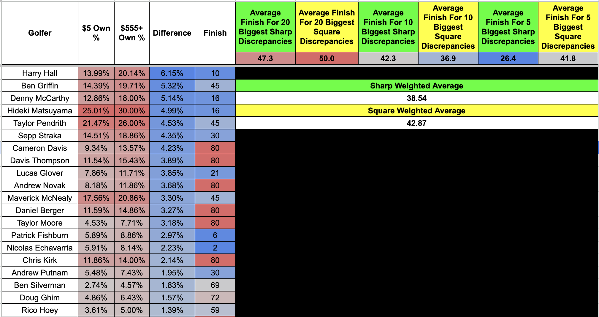
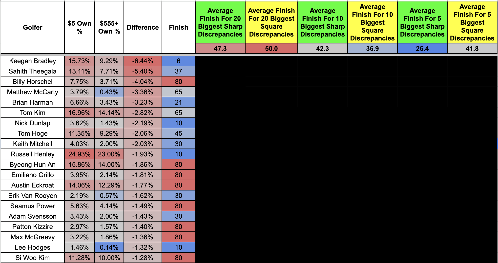
One thing you might notice is the direct comparison we get for every golfer in the field. The larger ownership difference between the $555+ contests and the sub-$5 games, the more heavily my model considers that golfer "sharp." Image one would be the sharpest players for the week. Image two is the inverse of that, where those names were the "squarest" golfers on the board. This is no different than when someone dives into "Pros vs. Joes" data for NFL betting and follows where the "big money" is landing.
"Finish" would be the place a golfer came in on the leaderboard for the week. "Average Finish" would be the average position all players landed. One example is that the top five "sharp" plays on the board averaged 26.4 on the leaderboard at the Sony Open, versus 41.8 for the "squarer" options.
I'd also implore everyone to see how every "missed cut" (a player who didn't make the weekend and was cut from the tournament on Friday night) got labeled with an "80th place" finish. There is a world where I could have gone closer to 90 or 100, but I wanted to make it a more middling result that didn't massively alter the weekly outputs. People sometimes skew the data more than necessary when running experiments based on the results.
Missed Cuts And Top 10 Finishes
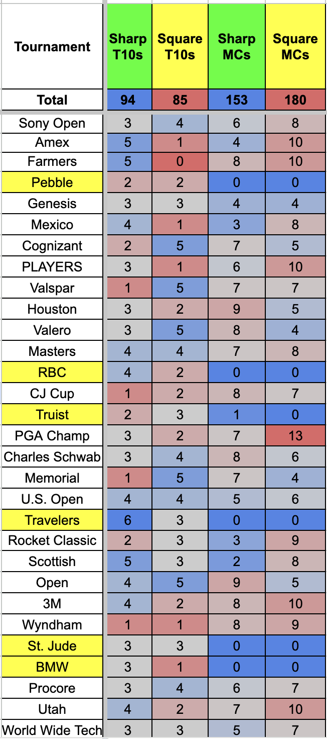
What that chart is looking at above would be your 20 "sharpest" and "squarest" plays on the board for a given event over a 30-tournament sample size in 2025. Anything in yellow just means a tournament didn't have a cut that week.
That left us with six no-cut tournaments and 24 tournaments that saw the field trimmed down before the weekend. When we remove those "no-cut" events from the returns from missed-cut performances to get a more accurate answer, here is where the data landed over the season:
Sharp T10 Finishes: 94 (15.66% rate)
Square T10 Finishes: 85 (14.16% rate)
Sharp Missed Cuts: 152 (31.66% rate)
Square Missed Cuts: 180 (37.50% rate)
***One of the listed missed cuts at the Truist was an in-tournament withdrawal from the field.
One data point that stands out right away is that sharp and square players are relatively close to one another in achieving high-end production when looking at a larger range of 20 players at each end of the spectrum. A 1.5% difference will help highlight and push big-money players over the edge in large-field events, but the more stark contrast came down to the nearly 6.0% differential we saw in sharp players getting their six golfers into the weekend to play four rounds.
That made me wonder what happens to the data as we begin to define more exact and specific ranges. For example, if the top 20 sharp golfers in every tournament yielded a 15.66% top 10 rate and 31.66% missed-cut rate, what happens when we look at only the top 10 for each event? The top five? Does that give sharper players a greater advantage in identifying edges?
How Did Different Ranges Change The Data?
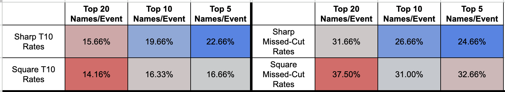
The sharp advantage really started to come into play when we condensed the data points into a finer set of returns. Sharp players saw a 7% increase in projection for top 10s when shortening the metrics only to find the top five outliers per event. While the square players did surprisingly get 2.5% better themselves, we saw the expected rate go from a 1.5% advantage to 6% when trying to find an ultimate sharp advantage of only the high-end differences.
Surprisingly, the data wasn't quite as stark for making or missing the cut. We saw that both groups improved as they moved further apart in their opinions, with the ultimate difference shifting by only 2.16% in favor of sharp players. Once again, that is enough to show that sharp players are better at identifying an edge, but it did start to sway my opinion a little from the initial returns.
What that data showed me was that taking a larger range per event started to move us into this territory where the edges between our middle tiers were not quite as large as perception, but a sharp player's ability to find the ultimate advantage from the most significant discrepancies is where the edge lands most heavily. That isn't necessarily a surprise return, though if that continues to hold across other sections, golf might have a weird dichotomy where overall player pools for DFS are less critical for singular decisions than the advantage you receive for correctly identifying a few targets that you want to be massively above consensus on per week.
What that means in easier-to-understand terms would be that the close calls that you make with your player pools throughout the week won't make as much of a difference as you might believe compared to getting the larger disparities correct. Perhaps we all spend too much time weekly trying to figure out if we want to round our pool out with that random $6,900 golfer versus $6,8000 golfer. In reality, the variance is minimal either way.
Do Specific Tournaments Matter In The Output?
Our three examples here will be tournaments with a cut (non-majors), tournaments without a cut, and major championship contests.
We don't get enough examples to dive into throughout the year to convey much more than a glance into the major or non-cut world, but here is how the results presented themselves in 2025:
Tournaments With A Cut
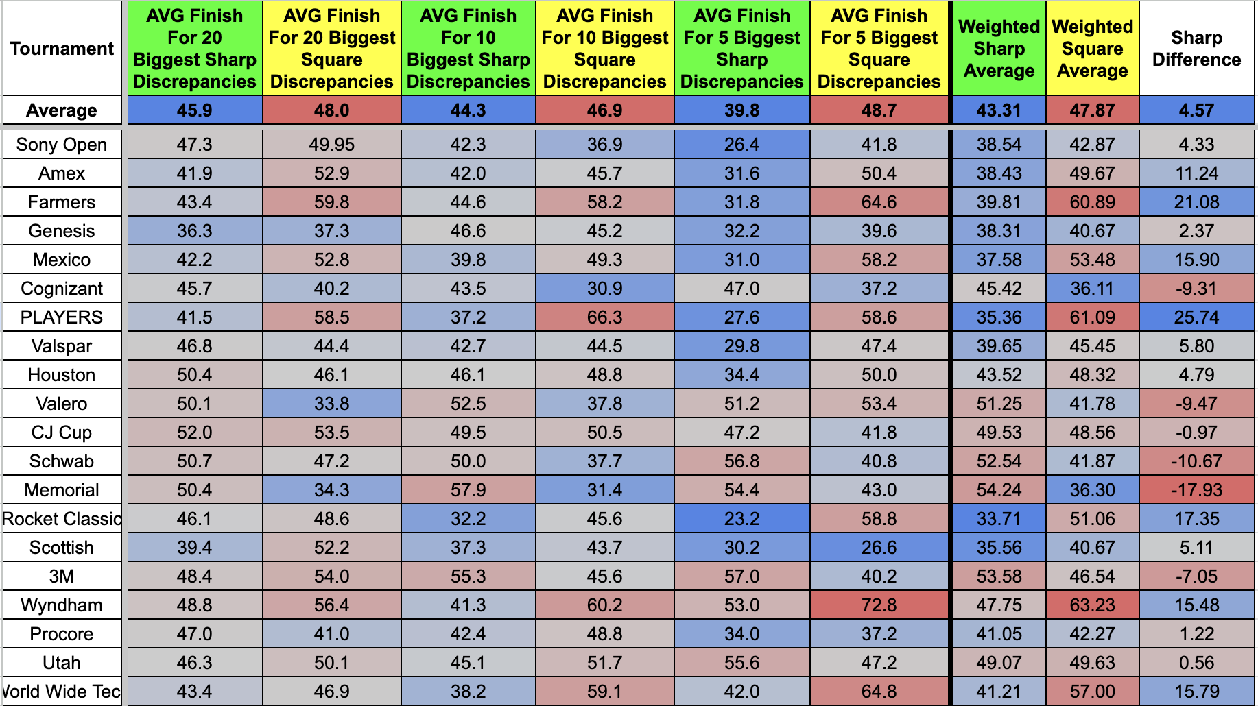
Sharp players led the way at a 14-6 clip (70%) when diving into the pure win/loss rate across the 20 events. Those numbers can be found under the "Weighted Sharp Average vs. Weighted Square Average" returns. What those datapoints are signifying when you see a "sharp average through 20 events of 43.41 versus 47.87 on the square front is the exact position on the leaderboard the top 20 discrepancies placed for the week by each user type. The number beneath that total is how sharps and squares performed during individual events throughout the season.
Your best sharp performance came at the Players (35.36 versus 61.09), where your top square showing landed at the Memorial (36.30 versus 54.24).
Interestingly, many of the same margins that emerged for overall performance reemerged here, as the gap between 20 players, 10, and 5 amplified those advantages for sharp users. We see a 2.1-spot difference for the 20 most significant discrepancies and an 8.9-position difference for the five most significant golfers.
Overall, that led to a 4.57-spot advantage for sharp users during tournaments with a cut.

Tournaments Without A Cut
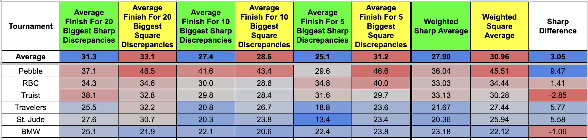
We know from the first section that many of the missed-cut rates remained steady when we looked at distribution marks for both sets of users. While that same consistency rate is going to be more up for grabs when players are faced with a tournament that doesn't present a halfway point of the field getting cut in half, it does appear that a guaranteed four rounds of golf should, in theory, limit the advantage that sharps users have for the week.
That is all normal on the expectation front. A lack of ability to separate from the pack convolutes the edge at its most basic level. Still, it is worth noting that sharp users won four of the six chances this year (66.6%), with no single event featuring an advantage greater than 9.47 spots on the leaderboard.
A no-cut tournament's 3.05 spot difference versus the 4.57-slot mark when faced with a cut would make me believe that a continuation of the data could push us further in that direction, although, as I said, that sample size is far too low to derive much from it. If nothing else, we should expect that trend to continue because of the edge we have seen sharp users have in predicting six golfers into the weekend.
Major Championship Events
During a major championship event, you will always hear podcast hosts or writers talk about all the "dead money" that is entering contests. Extremely soft pricing from top to bottom has become a staple of these events, and many of the users who are entering these contests are classified as something beyond even square players, since we may only see them compete in golf DFS four times a year.
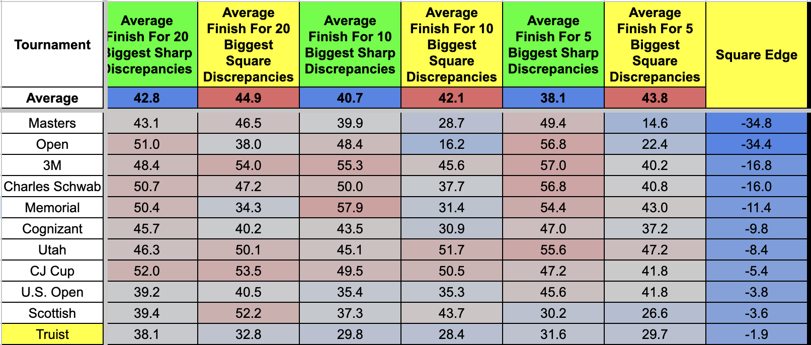
That should make these some of the better contests to enter for sharp players throughout the year, but the exact opposite seemed to take place when running the data. We need much more than four tournaments to determine an accurate expectation, but it is worth noting that two of the three largest square edges of the year for all players occurred at the Masters and the Open Championship.
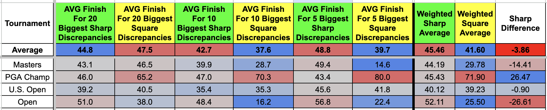
Square users won three of the four meeting this year (75%) and actually flipped the script from every other output we have seen of top-five discrepancies massively pushing in the favor of sharp users. In fact, squares substantially posted their best marks of the season for those high-end differences, with those Masters and Open showings nearly doubling the expectation elsewhere.
Overall Thoughts
We knew, before even coming into this experiment, that square players had their work cut out for them to perform better than sharp users. If that didn't turn out to be the case, big-money players wouldn't exist.
Sharps won 19 of the 30 events this season (63.33%), won all the statistical categories we covered throughout the year, and found themselves in much more advantageous spots in most weeks. However, a lot of those disparities were not as large as I had projected before we started this research.
Squares posted overall top-10 rates at a sub-two percent difference when comparing their outputs to sharps, averaged around only one more missed cut per event than sharps did when grading the 20 biggest stances on the board for each side, and actually found quality pockets of success throughout various events this year.
What squares did not do well, by any stretch of the imagination, was keep pace with sharp users in those critical choices to create leverage versus the field. We saw that answer time and time again from sharp players lapping their counterparts when we shrunk the data to include only the five most significant ownership contrasts for each party versus 10 or 20.
For comparison sake, an average top 20 edge for both sides landed the sharps 4.1 spots higher on the leaderboard in making better decisions. When using only 10 names, it actually shrunk to 3.3 spots for the sharps advantage. And last but not least, we saw it rise to a staggering 11 spots when using only the top five golfers for each side.
I don't want anyone to miss that last comment I just made because that takeaway might be the single most important piece of information from this entire article. "The sharp advantage decreased from 4.1 spots to 3.3 when comparing the top 20 to the top 10 leverage spots, and then jumped back up to 11 spots when just condensing to the top five. What that shows is that square players can hold their own on the more median decisions throughout a week.
If we believe that to be true, I stand by the comment I made very early in this article that most of your lineup decisions are going to be marginally impactful to your overall performance. Sharps are better at pinpointing small edges, as evidenced by higher top-10 rates and lower missed-cut percentages. However, this isn't entirely true in the data because we can't assume every square DFS player is making 100% square choices. Your average square player that builds a lot of lineups is going to generate a hodgepodge of names in all areas, including some sharp golfers for the week.
My advice to anyone reading this article would be to build your player pool for the week and not sweat the close calls on those final few names that make or miss your builds as much as you do the more impactful choices. More often than not, it will deliver very trivial outputs, and where the true edge comes into play is in finding the five players that you are going to build around at a higher rate than the public and locating the five players (of true popularity) that you want nothing to do with for the week. If you can start doing those two things correctly at a higher percentage, your builds start landing in this very advanced structure that gives you an edge over the field and generates a higher return on your investment.